One of the first things new agents and buyers realize is that awful real estate pictures are everywhere. There’s just something about the combination of real estate agent + homeowner + camera that leads to an artistic disaster. That’s why we reached out to some of our favorite agents and friends to gather the worst of the worst real estate listing photos for your viewing “enjoyment.”
Of course, since our goal is to make bad agents into good agents and good agents into great agents, we also worked with our friends over at luxury Manhattan real estate brokerage Warburg for some ways to avoid the photographic disasters below.
1. The ‘Number Two’ Hallway
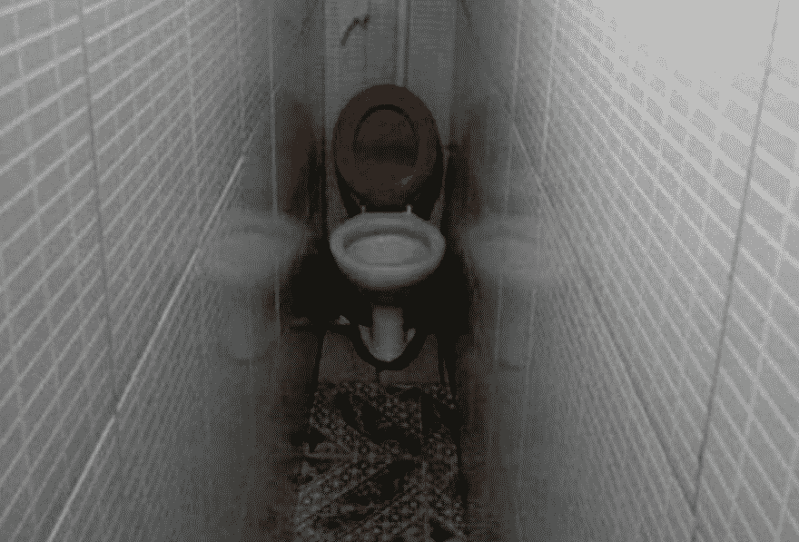
“So, I’m thinking instead of making your hot tub smaller or getting rid of the double sink, that we just put the toilet into this long skinny hallway here.”
“Are you really an architect?”
“No, I work at Arby’s, but my cousin always said I was good with drawing.”
2. ‘♫♬🎜 Come With Me & You’ll Be in a World of Pure Imagination …’
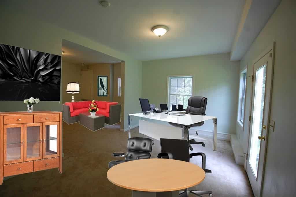
“OK, I’m thrilled you chose me as your listing agent. You won’t be disappointed with our marketing services. Now, I’m thinking we start with some virtual stag- …”
“My nephew Francis is good with the computer.”
“Right, OK, but we have a talented virtual staging company we work with who make some real- …”
“My nephew Francis is gonna do it. Don’t make me change my mind. Now, for pictures, my cousin Jenni has a real good camera.”
😬
3. I Treat My Chickens Like Family & Vice Versa
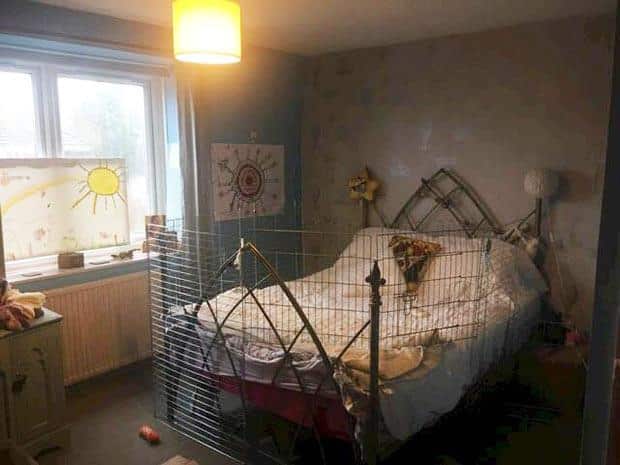
“You know that show ‘Fixer Upper’ with that nice lady, Joanna [Gaines]?”
“Yeah, sure.”
“Well, she said country chic is in this year.”
“Say no more. I’ve got a shed full of chicken wire.”
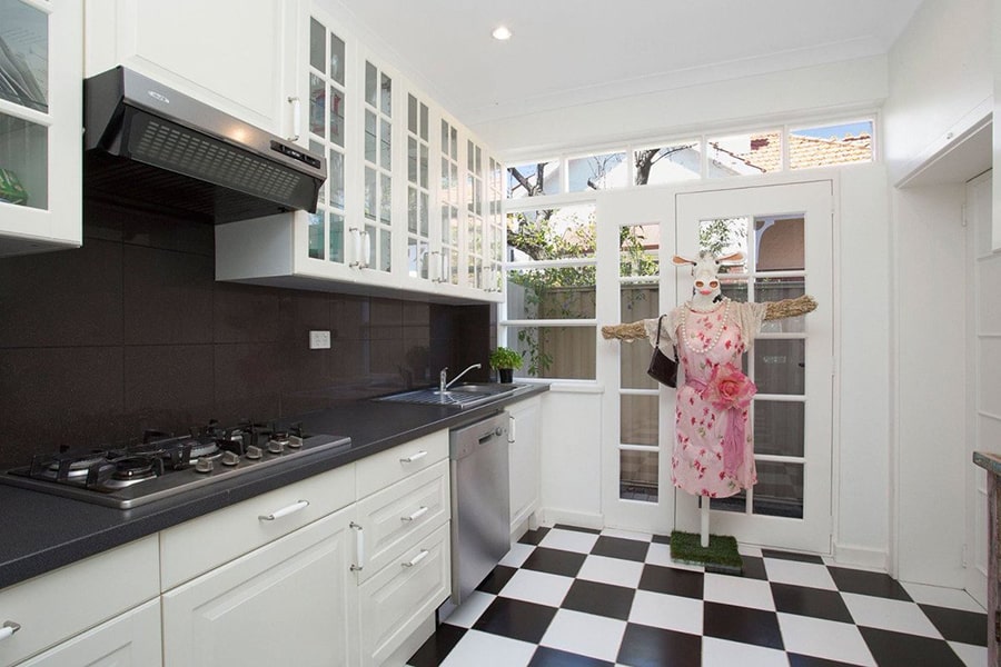
4. The Long Cow Is Watching You Cook
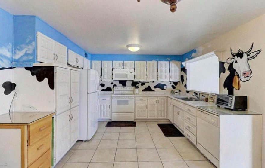
I mean, we get the cow theme and all. It’s as classic an animal kitchen motif as roosters are, but I mean … I think the idea is to use multiple cows in your kitchen, not a mythical long cow. Otherwise, you end up here in our bad listing photos article.
Download 12 Free Real Estate Memes
5. They Spared No Expense …
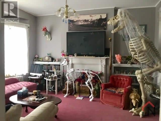
Kind of hard to say what’s off about this listing picture―the red carpet with the red velvet saggy chair, or that strange-looking beige armchair. Maybe it’s the TV placement? That mantel also looks a little dated, or maybe IT’S THE GIANT FREAKING T. REX SKELETON WEARING A BRIDAL VEIL NEXT TO THE DOG (?!?!?) SKELETON IN THE LIVING ROOM. Could be the angle here too. I mean, taking this shot head-on would probably make a nicer overall picture.
6. ‘Honey, Should We Hire a Realtor? Nahhhh, We Got This’
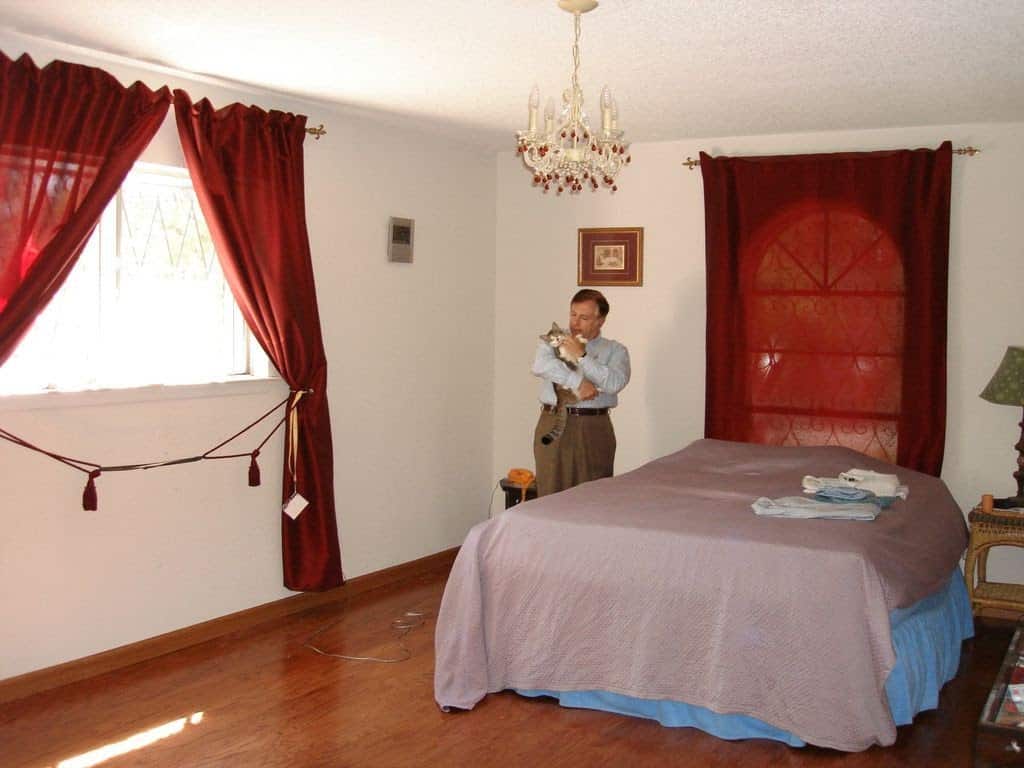
Example number 7,861 that proves FSBOs are a goldmine for agents who aren’t afraid to pick up the phone and call them.
If you’re still not convinced, spend a few minutes scrolling through a FSBO site and you’ll learn just how horrible 99% of FSBO marketing is. When you get back, our best FSBO scripts article will be waiting for you.
7. Do You Remember 1990s Video Games? Do You Want to Live in One?
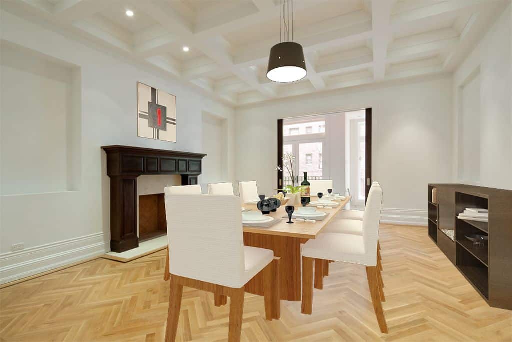
Well, here’s your chance. This uber-bad virtual staging made us say “what the hell” out loud in a crowded coffee shop. Did I mention this was done for a multimillion-dollar townhouse in Manhattan? A listing where the commission was well into the six figures?!
The agent shall remain nameless, of course. For now, we can all bask in the sheer awfulness of this virtual staging train wreck.
8. ‘♫♬🎜Strike a Pose, There’s Nothing to It’
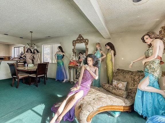
This one is actually kind of fun in that “design is my passion” kind of way, but just imagine being in this place AT NIGHT. 👀
9. YOU SHALL NOT PASS!

Unless you have a milk bone … or any treat, really. OK, OK, I’ll let you pass if you give me a quick head scratch.
10. Waterworld 2.0
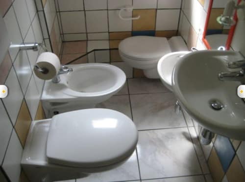
Remember “Waterworld”? Kevin Costner fighting pirates or something in a post-apocalyptic world where everyone lives on floating, man-made islands in the ocean? This is like the bathroom fixture equivalent of that movie.
The weird part is that if you know anything about plumbing, then you know this would take an absolute eternity and a small fortune to install. The obvious question―and we have that monastery web page open in another tab just in case―is why?
11. ‘Why Yes, I Do Like Cats … How Could You Tell?’
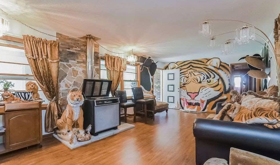
In my daydreams, that jukebox only has one song on it and it’s “Eye of the Tiger“—and the owner plays it on a constant loop all day long.
12. Thomas Is Watching … Thomas Is Always Watching

This show was on well after my childhood ended, but isn’t there something just kind of creepy about Thomas the Tank Engine?
No? Did you see the one where they sealed a bad train-person into a tunnel with a brick wall “The Cask of Amontillado” style?
13. ‘Hear Ye, Hear Ye! The Yellow Emperor Is Selling the Yellow Palace!’

Sometimes, yellow gets a bad rap. Even though it’s a bright, happy color, it’s hard to see it in a listing photo and not think of all the less than well-thought-out design choices of the 1970s. Still, it can look just lovely in a kitchen, and a more subdued goldenrod shade can make a killer accent wall.
Of course, when it comes to bathrooms, yellow is probably not the best choice. Do we need to spell this out?
14. ‘Hear Ye, Hear Ye! The Queen of Flowers Has Decided to Sell Her Summer Palace’
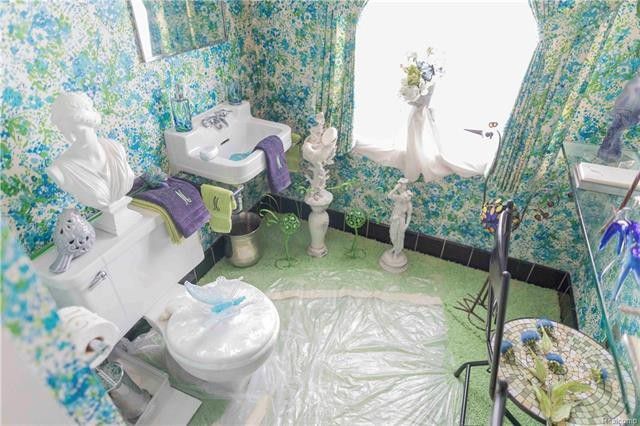
So, is that carpet covered by a plastic tarp? Also, is that toilet seat made out of mother of pearl? Then, there’s the statues … and that wallpaper. I think I need to renounce all worldly goods and become a Buddhist monk. I will never know the answers to these questions, and I think I need spiritual help because of it.
15. The Pinnacle of 1970s Carpeted Chic & a Naughty Surprise …
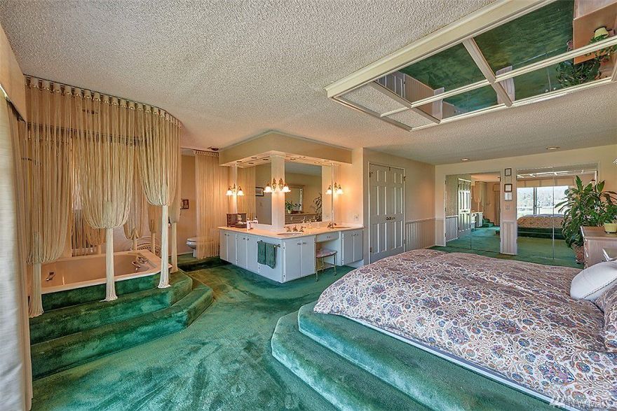
Check out how enormous this room is. It has double doors and a built-in Jacuzzi. This room likely cost the owners a pretty penny when they first built the house in the halcyon days of the late 1970s. The somewhat cheeky new owner added their … uh … special feature over the bed. We’re thinking whoever owned this place drove a Corvette and wore lots of gold chains.
16. ‘Hear Ye, Hear Ye! The Red Prince Has Also Decided to Sell His Palace!’

Would you think I’m weird if I told you I kind of dig this look? I mean, not for a bathroom, but my cult’s ritual blood sacrifice room. We meet on Wednesdays and, this week, Harold is bringing donuts.
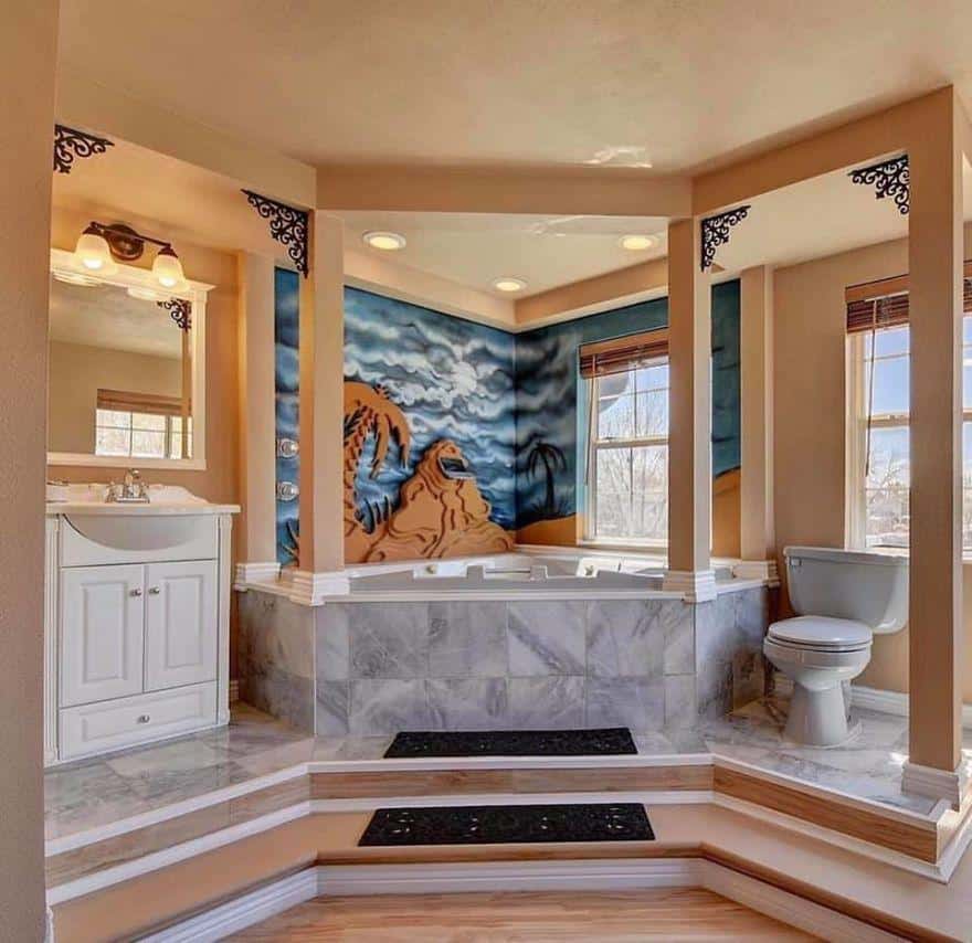
17. Is that … Jabba the Hut?
OK, maybe it’s the fact that I’ve been staring at stupendously bad real estate photos for the past what, five hours? However, I can’t help but see Jabba the Hut in that hideously bad mural over that hideously ugly tub that, for some inexplicable reason, is up on a pedestal along with the toilet and $99 special Home Depot sink.
18. ‘💀 GET OUT!!! 💀’
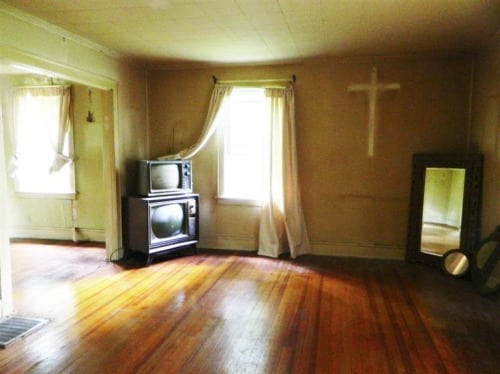
Speaking of creepy … yikes.
19. ‘The Ceremony Shall Begin at Midnight’
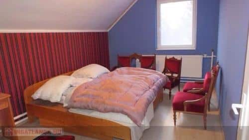
“Hey, thanks for letting me tour your house for my comparative market analysis. What’s happening in this room? Oh, I get it, this is just a storage issue where they put the chairs in the bedroom because you ran out of space in the dining room, right? Guys? Hello? Who are those people in the red robes?”
20. ‘My Nephew Said Twilight Listing Pictures Are Hot These Days’
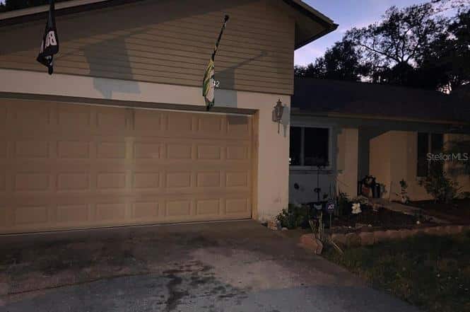
I mean, there’s a house here for sure—somewhere in the deep dark gloom. Was the listing agent being chased by a werewolf when they took this picture? Is that why they didn’t just back up like 3 feet so we could see the whole damn house?
21. ‘Can You Make It Brighter?’
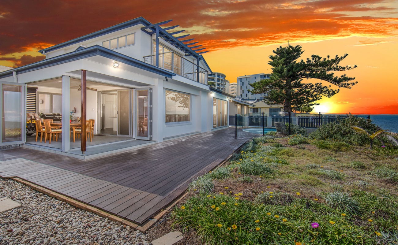
If I were a galactic overlord, I would make owning and using Adobe Photoshop a criminal offense for people who don’t know how to use it. Basic skills and sanity tests will be given before Photoshop licenses will be issued.
22. ‘Didn’t I Tell You My Nephew Was Good With the Computer? Look How Pretty!’
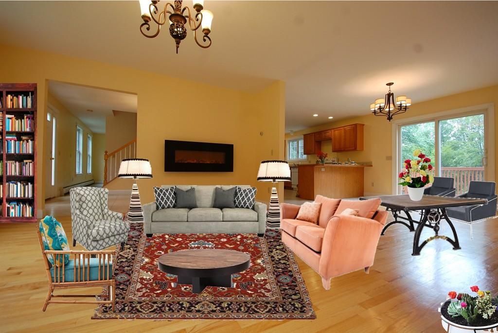
Please. No. No more. I can’t take it anymore. Someone, please make it stop. I’m going to have to spend all night on Mansion Global to detox from writing this article.
23. ‘OK, I Guess Looking at a Few More Won’t Hurt … Dear God, Why?!?!’
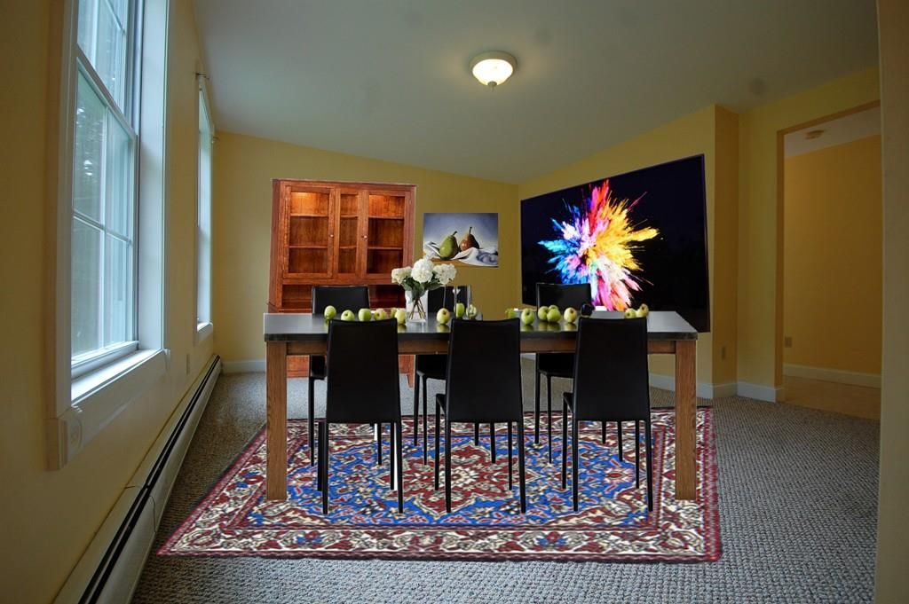
I mean, what goes through someone’s head when they get something like this and think, “Yep, that’s the one for Zillow!”
Let’s put aside the fact that this agent decided that putting a carpet on top of a rug was appropriate for a dining room and just focus on the sheer madness of it all.
24. A Chef’s Bedroom
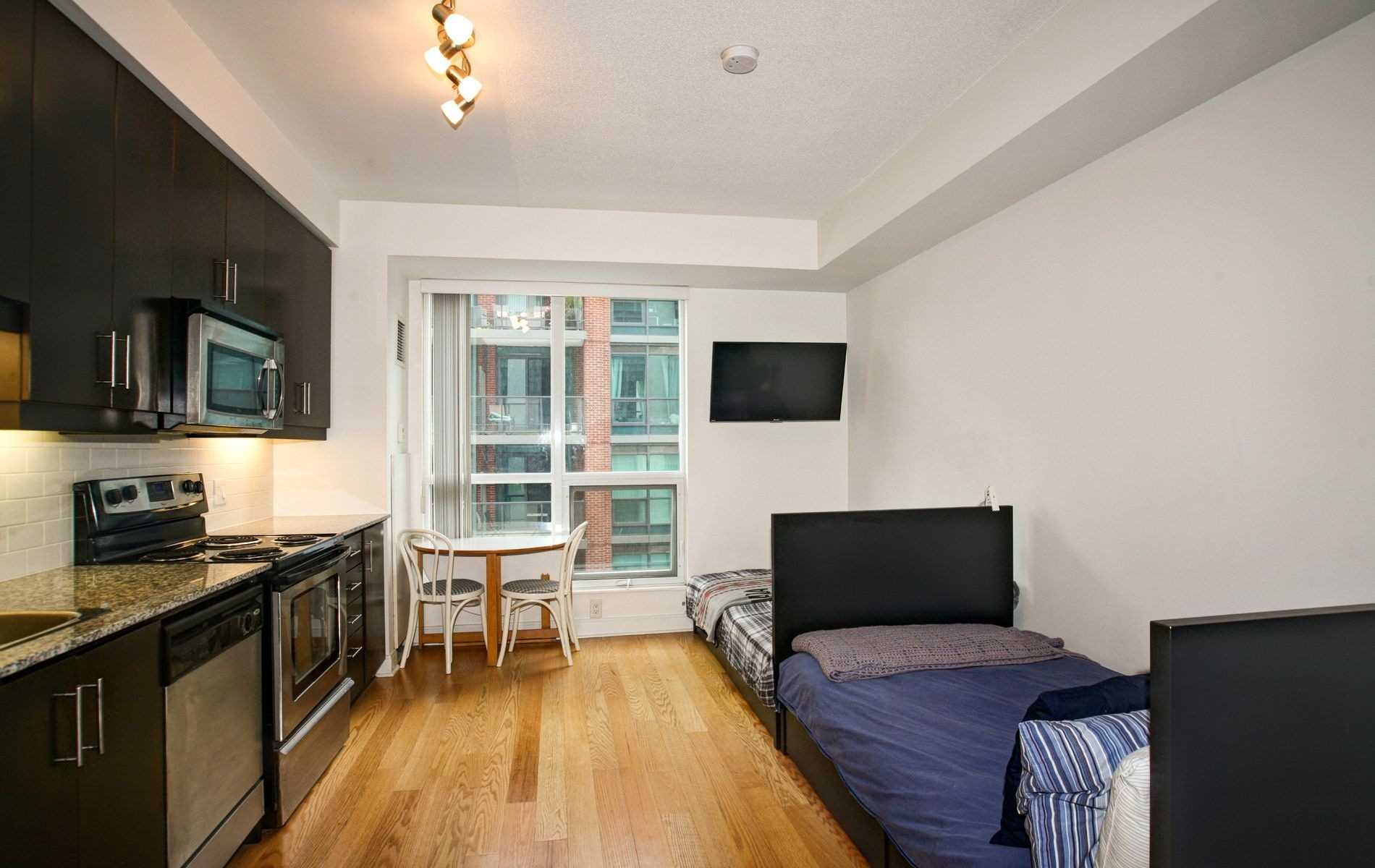
“So, here, we have a formal dining room and sitting room. Next, we have the chef’s bedroom.”
“Wait, don’t you mean a chef’s kitchen?”
😉
25. When Your Architect Mistakes His Viagra for Aspirin
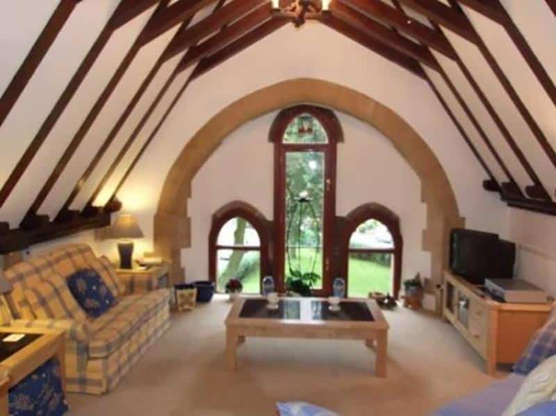
Sometimes, a window is just a window. However, in this case, we can’t help but wonder whether the architect had something else on their mind when they designed this monstrosity.
26. The Lord of the Cows

Holy mother heifer! Pray for our sins, now and at the hour of our milking, or from the looks of it, before you leave for the country club social? We’d ask why but, yeah, just rolling with them now.
27. Must Love … Animals?
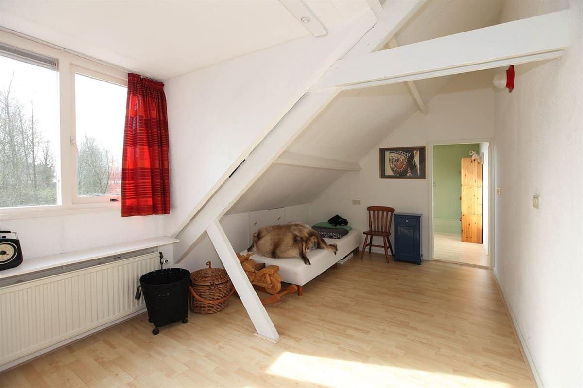
Or is it a love for weirdly folded blankets? Messed up panorama shot or maybe a dog moved too fast, so looked blurry in the picture? Never mind.
28. Ascending to the Throne …
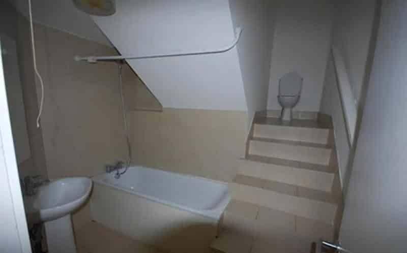
… because only lowly commoners have thrones on ground level.
Seriously though, these toilet thrones are actually weirdly common. Is it a plumbing issue? Some weird throwback interior design trend from the 1800s? If there are any plumbers reading this, can you please solve this mystery in the comments?
29. ‘Yes, But It’s a Very Upscale Basement Dungeon Room’
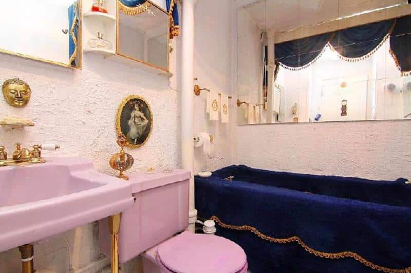
Ah, yes, your throne in the royal basement awaits you, my grace.
I wonder if they take off that blue velvet (?!) tub cozy when they take a bath, though.
30. ‘Did You See What My Nephew Did With the Kitchen Pictures for Zillow? He’s Very Good on the Computer!’
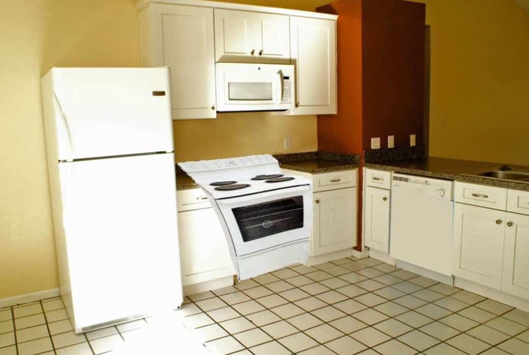
You know, I’m actually pretty good at Photoshop and I have been wracking my brain trying to figure out how on earth they managed to mess up this badly.
31. ‘Where’s Your Bathroom?’
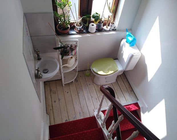
“Hey, where’s your bathroom?”
“It’s on the first-and-a-half floor.”
32. ‘Pfft, No Way I’m Hiring a Real Estate Photographer. I Can Do Fine With My iPhone!’

Actually, this might be the work of a conceptual artist who was trying to highlight the inherent absurdity of the commodification of living spaces in the digital age.
33. Perfect for Multitaskers!

Just think, you can stack some cook books on the back of the toilet and save some time.
How to Make Sure Your Listing Pictures Never End Up Here
While we can’t force your homeowner to have better taste in bathroom fixtures, we can leave you with some general tips to keep people from laughing at your pictures on Zillow. That’s why we reached out to our friends from Manhattan luxury brokerage Warburg Realty and the founders of Real New York for their expert opinions on what to avoid.
Trust me when I say Manhattan agents have seen all of the worst pictures you can imagine, and then some.
“When I am looking at interior photos, I like to be able to see what the view is from the windows. A DSLR (digital single lens reflex) camera, which is what professional photographers [should] use to shoot listing photos, will not get the window view unless they expose it.
“It takes more time to expose properly for the windows but, in the end, it completes the image and tells a more accurate story about the home. When the windows are not exposed properly, it looks like a view of white light.
“Also, if there are blinds on the windows, make sure they are all the way up and even.”
“Listing photos are crucial for garnering interest in your property. It is essential that you make the rooms as neat as possible and remove any clutter. My tip is to view your apartment as if it was a hotel room or suite—how would you want it to look when you check in to a 5-star hotel?
“Some simple tips:
- Make the room appealing: Set out flowers and add some life into the room.
- Kitchen: Remove everything off the countertops—everything. Toasters, coffee makers, sponges, and any clutter on counters.
- Bathroom: It is a must you remove all soaps, toothbrushes, and countertop items. Keep it clean and be sure to hide those extra toilet paper rolls somewhere else while photos are being taken.
- Try to limit the family photos. A few are OK to have out, but it might be nice to pare back a little, and keep things looking lighter and more open.”
“Rule number one of any photo shoot: Lower the toilet seat. There is nothing that sends a worse message than looking into an open toilet. Another bathroom rule of thumb: There is a ‘trend’ toward removing the shower curtain prior to photography, but my thought is to leave the shower curtain in place and have it open to show the tub and tile work. If the shower curtain is closed, I am suspicious that it is hiding something.
“The bigger overall question regarding bad or inappropriate photography, in the age of digitally altering photos, Photoshopping, and virtual staging, is: Why show bad photos? If the role of the photo is to ‘sell’ the listing, why show a poor photo, unless the ‘bad’ photos are the best of the photo shoot? In that case, it is better to have the photographer return to reshoot or use no photo and rely on the description alone.
“It goes without saying that ‘inappropriate’ or ‘unphotographable’ items should be removed before the photographer’s arrival. I had to request that a seller remove a leather sling, prominently featured in the master bedroom, before the property was photographed.”
“Never, ever post photographs from your iPhone, even if you have the latest iPhone with the ‘best’ camera a phone can have. Always hire a professional photographer to showcase your listing.
“A photographer has the equipment, the software and, most importantly, the experience and eye to capture the property from the best angle. We live in a visual world and if photos of a property are not pristine, you are doing your seller injustice. Buyers are drawn to photographs that entice them.”
“I think putting a pet, no matter how cute, is a bad idea. I think it looks amateur to do this—we are selling a home, not pets—but, more importantly, it can be a turn off to anyone who doesn’t like animals. We are trying to bring in the widest audience possible, no matter how cute the overly groomed purse-dog looks. Furthermore, many people suffer from dog or cat allergies and can’t even visit an apartment that has pet dander. Just take the pet out of the photo. It’s tacky.”
 7 Tips From Manhattan Luxury Agent George Case
“I see so many listing photos with so many ‘don’ts,’ I often wonder if the clients wince when they see their listing. The key to real estate photography is that it is aspirational and edits a seller’s personal space to the point that buyers can see themselves living there.
“A few easy mistakes to avoid are:
1. Don’t leave dirty or heavily used dishes, coffee and/or teapots, dishtowels, toasters, toaster ovens, or microwaves on the kitchen counter. Kitchen photos should be as spare as possible—potential buyers are looking at finishes, appliances, and the layout. A full counter implies a lack of storage and, potentially, a lack of cleanliness.
2. The last square on a toilet paper roll shouldn’t be in the bathroom photo. It’s annoying when someone you live with strands you with it, and it’s annoying in a photo—it’s not pretty and looks a bit trashy.
3. For the same reason that the kitchen photo should be sparse, so should the bathroom. Leave toothbrushes, old soap bars, ugly plastic soap dispensers, and pretty much all personal hygiene products out. That’s your client’s business and no one wants to see it. Again, it implies a lack of storage and an inability to keep it organized.
4. Make the bed and make sure the old iron base is covered. Rumpled sheets, mismatched bedding, and a mattress or box spring peeking through the bedding could be shabby chic, but it rarely is. Tuck the sheets and bedding tight to imply cleanliness and order. It’s much easier to sleep in than a sack of fabric. This is a room that should feel like an oasis, so the bed needs to look aspirational and thoughtfully ‘pulled together’—pun intended. Throw pillows can substitute for limp, overused bed pillows.
5. Family photos need to be edited or taken out of most rooms. Distracting, not relevant to a potential buyer, and often unorganized, family photos should remain personal.
6. Don’t photograph the inside of a closet unless it’s impeccably organized and a selling point. Unless it’s a showstopper walk-in with great clothes arranged on well-crafted built-ins, it’s too personal and, if overflowing, implies a lack of storage space in the apartment. Let the floor plan do the talking when it comes to closets.
7. Jumbles of toys, playpens, and strollers should be taken out prior to shooting. If you’re photographing a child’s room, edit and compose cute toys and books. Too many toys and children’s things look messy and scream ‘we’ve grown out of this space and need out.'”
“Don’t take photos in poor lighting. Lighting is everything when it comes to taking pictures. Dark photos limit a potential buyer’s ability to see all the beautiful features of a home. Poor lighting can make a big difference. The darker the light, the smaller the room comes across.
“Natural light is utterly important in setting the mood within a house. Open your blinds and let the light inside. Don’t be afraid of using lights as a secondary source to brighten up the room.”
“Always avoid the reflection of the photographer when taking pictures of a listing. A house can have many reflective surfaces, like mirrors, windows, and even shower doors. Taking a picture while using the wrong angle might provide pictures where your reflection is visible.
“You want the potential buyer or renter to be able to picture themselves in the listing—and not the photographer. So, always check if you’re using the right angle before you’re beginning to shoot.”
 Don’t Take Pictures of Every Little Detail
David Barrick, Coldwell Banker, Schererville, Indiana
“While it may be tempting to photograph every little detail of the home to make the buyer feel like they are really there, what you’re really doing is overwhelming them and/or causing them to lose their attention. Instead, find that sweet spot by making sure they are able to get an idea of the layout and features through listing photos, but are still intrigued enough to come see the home for themselves.”
 Take Down the Holiday Decor
Jennifer Piglowski, Coldwell Banker, Saint Charles, Missouri
“Don’t use photos that have holiday decor as it will date the photos if the listing does not sell immediately. If you do use photos that display holiday decor, be prepared to reshoot after the holiday if the listing is still being marketed for sale. The same goes for exterior photos that show snow, or trees without leaves if you are now in full bloom.”
 Avoid Overexposing Your Pictures
Donna Mercier, Coldwell Banker, Lake Forest, Illinois
“I believe that one of the biggest mistakes a photographer can make when photographing a property is the overexposure of light, which washes out the particular details of a room and its unique characteristics.”
 Clean & Straighten BEFORE Picture Day
Esther Nobe, Coldwell Banker, Saint Charles, Missouri
“You don’t have to be Norman Rockwell to paint a scene. Clean up the space and move things around if necessary. Straighten that comforter, tuck in those sheets, move that pillow, declutter the kitchen counter. Don’t be in a hurry—you have one chance to visually attract a buyer.”
 Depersonalize the Kitchen
Candace Taylor, Coldwell Banker, Highland, Indiana
“Removing some of the more subtle things from your kitchen can really make the home look better for photos. Consider removing the kitchen garbage can, dog bowl, and dish towel, as this can make the photo so much cleaner.”
 Use a Real Camera, Not Your Phone
Salena Gutierrez, Coldwell Banker United, Realtors Austin, Texas
“Don’t only use a phone camera. Although phone cameras have come a long way, they often produce photos with bad lighting or that are too close that you can’t see the whole room, and I’ve even seen upside-down photos get posted.”
 Highlight Great Views
Rudy Vincent, Coldwell Banker United, Realtors Austin, Texas
“Listings that promote great views need to show it in the photos. I see so many shots of downtown views, but they are a little tiny blob in the photos or don’t capture the entirety of the view. Either get a better photo of the view or don’t use it.”
 Include Shots of Nearby Amenities
Scott Bullard, Coldwell Banker United, Realtors Austin, Texas
“Not including photos of the area’s amenities or nearby activities (pools, shopping, bike paths, and so on). With so many folks relocating to Austin, people like to see the community as well as the home. And don’t take the photos that are already out or other agents have used, without at least asking first.”
 Declutter!
Nyda Faith, Coldwell Banker Residential Brokerage, Dallas, Texas
“It always stuns me when agents do not declutter a home, or put away very personal items and even religious ones before taking listing photos. Buyers need to be able to picture it as their home, whatever that may look like for them. Don’t take photos without decluttering and properly staging.”
 Make Sure Pictures Have Descriptions & Are in an Order That Makes Sense
Susan Bearry, Coldwell Banker United, Realtors Georgetown, Texas
“More than just taking good photos, it’s a mistake to not add the description when oftentimes a room is not readily apparent, mostly in non-staged homes. Separating the pictures of one particular room makes it even more confusing. The buyer is left trying to figure out, ‘Wait, is this another picture of the office or is it the third bedroom?’”
 Hire a Professional!
Frank D. Isoldi, Coldwell Banker Realty, Westfield, New Jersey (Westfield East Office)
“Clearly, not using a professional photographer is your first mistake. The toilet seat is my BIGGEST pet peeve. Other things that I notice are beds with sheets hanging out below the duvet, towels in the bathroom that are not folded properly, and items left out on kitchen counters or in the sink. As far as staging … bad staging is worse than no staging at all.”
Over to You
Have an unbearably bad real estate photo or a killer real estate photography tip that you can’t help sharing? Send it to us at info@theclose.com or share it with us on Instagram.


 Take Multiple Exposures to Capture Views Outside Windows
 4 Simple Tips From Manhattan Luxury Agent Kathryn Landow
 There Is Simply No Reason for Bad Real Estate Photos
 Put the iPhone Away
 Just Say No to Pets in Listing Photos
 7 Tips From Manhattan Luxury Agent
  Lighting Is Everything
 Watch Out for Reflections
 Don’t Take Pictures of Every Little Detail
 Take Down the Holiday Decor
 Avoid Overexposing Your Pictures
 Clean & Straighten BEFORE Picture Day
 Depersonalize the Kitchen
 Use a Real Camera, Not Your Phone
 Highlight Great Views
 Include Shots of Nearby Amenities
 Declutter!
 Make Sure Pictures Have Descriptions & Are in an Order That Makes Sense
 Hire a Professional!
