When it comes to giving you home staging tips, it’s hard to know who to trust. Your spouse, your mother, your best friend from college—they love you, but they’re all liars.
Because of course they’re going to lie and tell you how great your home staging looks! After all, they don’t want to hurt your feelings. They know how hard you worked. You know who’s not lying? A potential lead scrolling through Zillow in bed with a cup of tea.
“Ugh! What on earth was that real estate agent THINKING?”
Don’t believe the liars. Instead, read our list of home staging tips from top-producing agents and the 21 deal-killing home staging mistakes to avoid:
Download Your Home Staging Guide
1. Not Creating a Virtual Tour of Your Newly Staged Listing
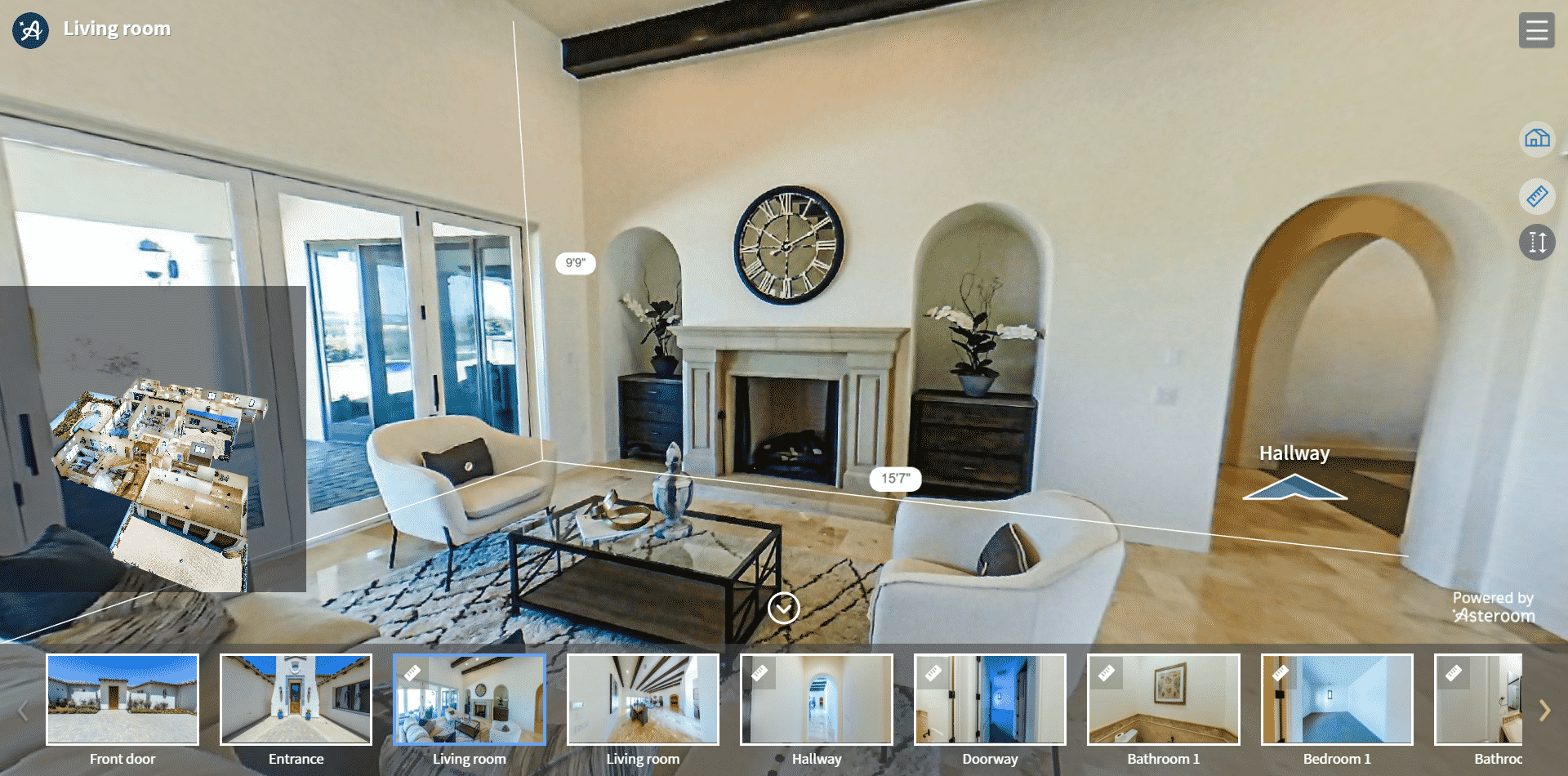
The only thing worse than having your friends lie about how much they like your home staging is not showing off your hard work online. These days, that means virtual tours. The only problem is that they can be very expensive.
How the Pros Do It
Luckily, you live in 2022 and competition means you no longer have to pay an arm and a leg for virtual tours. Using Asteroom, you can create professional-quality virtual tours for your freshly staged listing for a fraction of the cost of Matterport.
2. Staging With Furniture That Is Too Large for the Space

We asked Samantha Rose Frith of Warburg Realty in Manhattan for her home staging tips. While this tip is extremely important for square-footage-starved listings in Manhattan, it applies to any listing, regardless of size.
“Large sectionals are wonderful for lounging with friends and family, but if you’re staging a home to sell, they can eat up a lot of space—especially if they’re in dark colors. Think smaller couches with clean lines to open up the room, as we did by using a simple and neutral, modern couch. Here’s what it looked like after staging with a smaller couch:”
Samantha Rose Frith, Warburg Realty
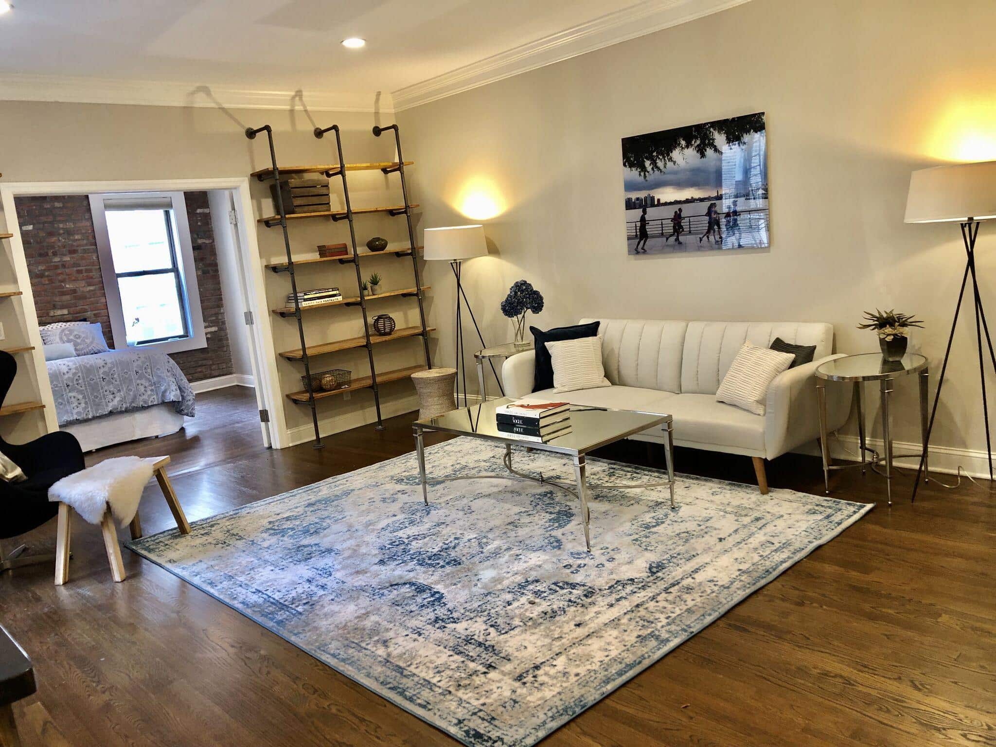
Not only did the space look and photograph better, it helped her close faster too:
“The listing had initially sat on the market for several months, but we received an offer within a week of staging and the unit sold.”
How the Pros Do It
When selecting furniture to stage your listing, think about how much visual space each piece will take up by considering both size and color. Unless you’re staging a dining room or small bedroom, make sure one piece does not dominate the space.
3. Letting the Homeowner ‘Help’ With the Staging

Many agents, but especially new agents, have a hard time saying no to homeowners. After all, they worked hard to get the listing, so why risk upsetting the homeowner by shooting down their ideas? Simple. Shooting down their bad ideas is part of your fiduciary duty to the client.
How the Pros Do It
Experienced listings agents know how to let “creative” homeowners down gently. They acknowledge the creativity of their idea, but then calmly explain why it might actually do more harm than good.
How to Get Listings: 21 Luxury Listing Agents Spill Their Secrets
4. Empty Bed Frames or Cheap Linens
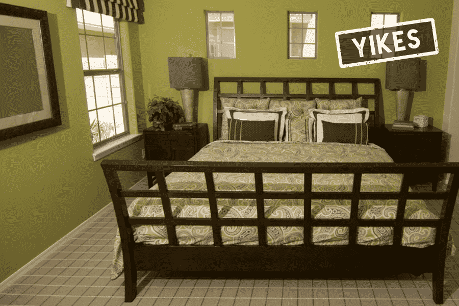
Even in some seven-figure-plus listings here in Manhattan, the word “bedroom” is often literal. It’s a room that can fit a bed and that’s about it.
Heck, even in a palatial 1,000-square-foot master suite, a king-sized bed will still take up space and there is no way to NOT have it as the focal point of the room.
That means cheap linens, pillows, or even worse, empty bed frames are a mortal sin against the gods of good taste.
How the Pros Do It
Air mattresses are incredibly inexpensive these days, so there is simply no excuse for an empty bed frame. While quality linens can be expensive, they might be a worthwhile investment.
5. Not Including a Pet in at Least One of Your Staged Photos

If you or your sellers are dog or cat lovers, then keeping your furry little friends out of your staged listing pictures can be a huge mistake. First of all, cute pet pictures are what the internet was designed for. Second, and more importantly, if you rope your seller’s pooch into the listing pictures, you can rest assured this photo will get shared on Facebook and Instagram.
You can then (tactfully) chime in and say how much fun you had shooting their little rascal when you were slaving away trying to make their home look awesome.
Photographing animals, especially restless dogs (is there any other kind?) can be a challenge without a high-quality DSLR camera and “fast” lens. All the more reason to hire a pro photographer for your listing photos!
6. Not Staging the Patio, Backyard, or Balcony
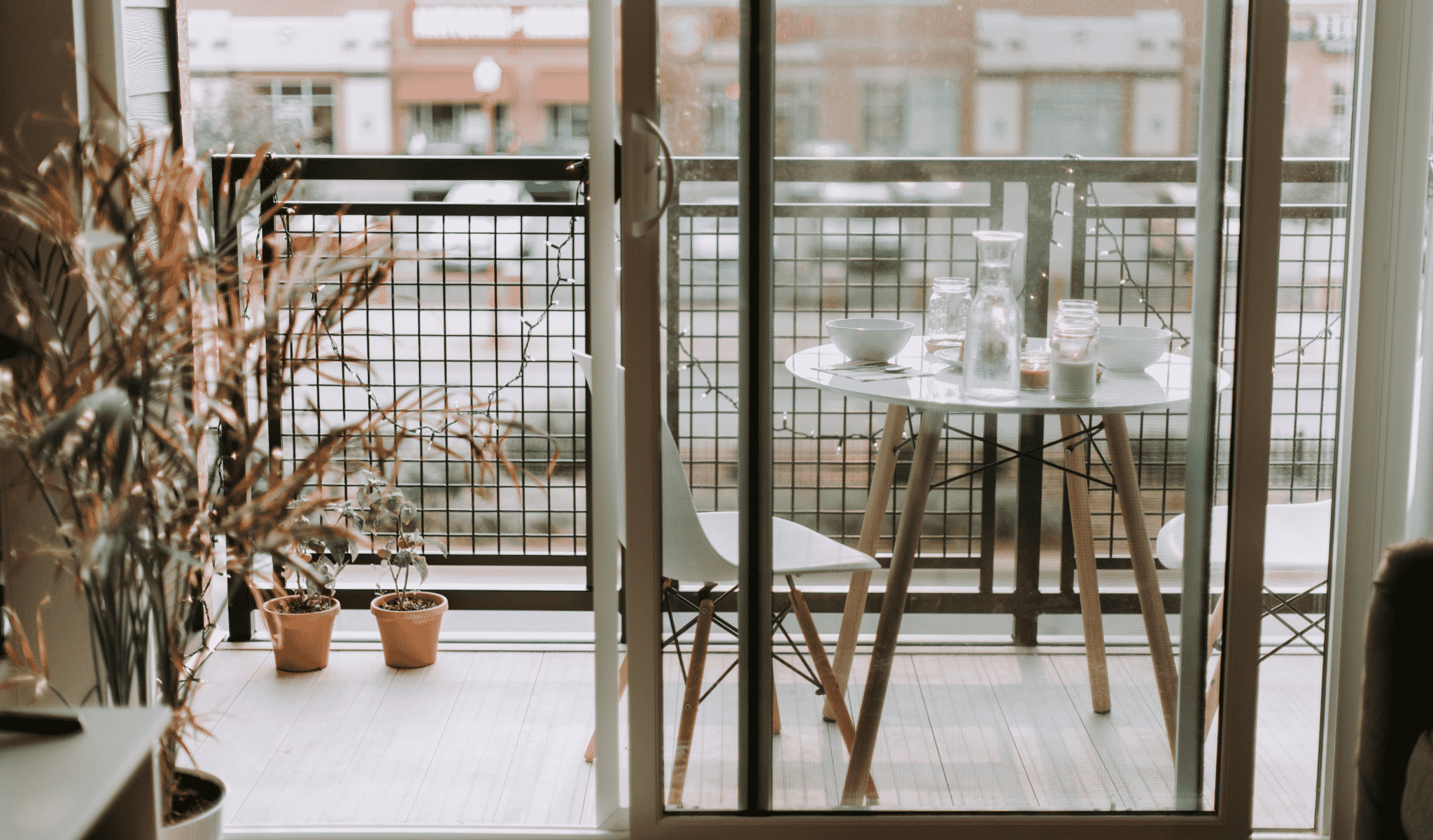
Think of all the buyers who really, really want usable outdoor space in their homes. People trading up from apartments, people moving from the city to the suburbs, and families with small children all place a premium on outdoor space. Here in Manhattan, outdoor spaces are rare and even more highly sought after.
How the Pros Do It
When you’re staging a listing, don’t forget to stage outdoor spaces like patios, backyards, or balconies. You don’t have to spend a ton of money here, just a few nice chairs, some plants, and a small table will do the trick.
7. Not Using Accent Walls

Considering how easy and affordable accent walls can be, it’s surprising how many stagers and real estate agents shy away from them. A well-thought-out accent wall can add some depth and drama to even the most boring room.
How the Pros Do It
If you want to try your hand at accent walls, think contrast. Dark greys, bright, energizing colors like Pantone’s Color of the Year Ultraviolet, or even removable wallpaper or graphics can go a long way to adding personality to your listing.
Need some accent wall inspiration? Check out the top ideas on Pinterest here.

8. Outdated Window Treatments
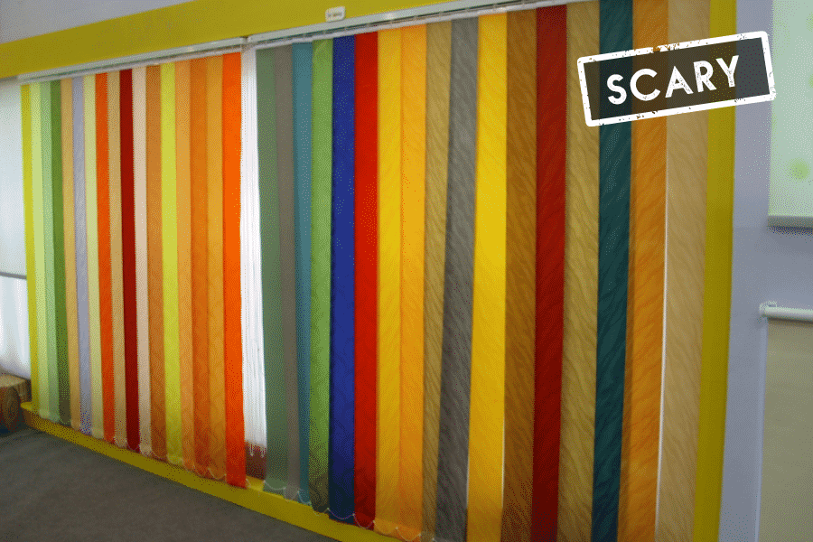
After paint and lighting fixtures, nothing can kill a room’s vibe faster than ugly, outdated window treatments. While those vertical blinds may have cost your homeowner a pretty penny back in the ’90s, today they just look sad and dated.
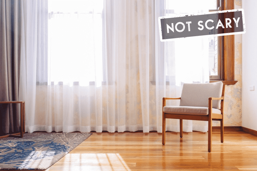
The good news is that like lighting fixtures, good-looking window treatments are affordable, and you only need a few styles on hand to match any decor. In fact, a set of sheer white curtains and a set of heavy dark, velour panels should match pretty much anything.
Patterns should probably be avoided, though. There is no faster way to pick out a cheap window treatment than from a poorly designed pattern.
How the Pros Do It
Forget West Elm or Pottery Barn. You can get almost identical-looking drapes and curtain panels on Amazon for a fraction of the price. If you line the back with Velcro, you can use one 108-inch panel to fit any size window.
9. Trying to ‘Go Viral’ With Your Staging
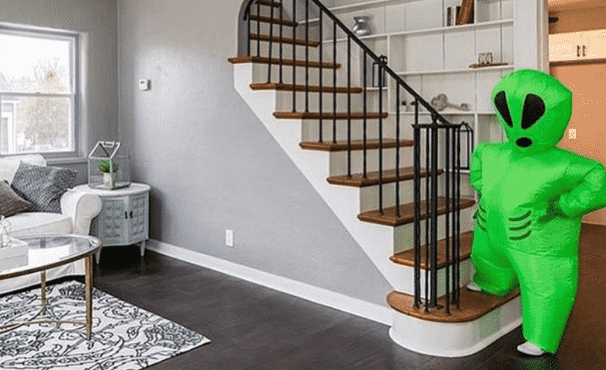
Sure, there have been a handful of real estate agents who have managed to “go viral” after including quirky elements in their staging. Sounds great, right? Well, there are two huge problems with this: 1. Being funny is harder than it looks, and 2. Going viral is even harder. So if you’re not a comedian, chances are your “viral” stunt will just look weird.
How the Pros Do It
They don’t. No seriously. Highly successful listing agents tend to avoid marketing stunts when trying to help someone sell the most expensive asset they own. So save the funny gags and stunts for your real estate videos.
7 Hilarious Real Estate Videos You Need In Your Life Right Now
10. Using Too Many Bold or Statement Pillows

Like the gallery wall, having an assortment of boldly colored or patterned pillows is very on trend. There’s only one problem—well, OK, three problems:
- Nice pillows are $50 each and up.
- If they’re too bold, they will become a focal point.
- They’re very personal. Not everyone will respond to your taste.
While you may be tempted to splash out on a dozen high-end pillows for your home staging, this could be a mistake. After all, nice pillows are very expensive, and bold pillows might not work well with other bold pillows.
Since the idea here is to buy versatile decor, I would avoid boldly colored or patterned pillows. Instead, stick to complementary patterns and colors, or at most, buy a few bold pillows.
How the Pros Do It
Love mid-century modern but can’t justify West Elm or CB2? Target’s Project 62 has passable mid-century looking pillows for less than $20.
If you’re looking for more home staging tips on a budget, check out this handy guide over on the Homelight Blog.

11. Not Taking Pictures of the Listing Prestaging
After the frenzy and stress of hiring a stager, coordinating with your owner, and lugging plants, pillows, and art all over the house, it can be easy to forget why you’re doing this.
For most listings, you’re staging for the photos you’re going to post on Zillow.
However, once you stage, it becomes very difficult and expensive to correct or restage a room virtually. For example, let’s say you staged a room as a home office, and a buyer kept wondering what it would look like as a bedroom.
How the Pros Do It
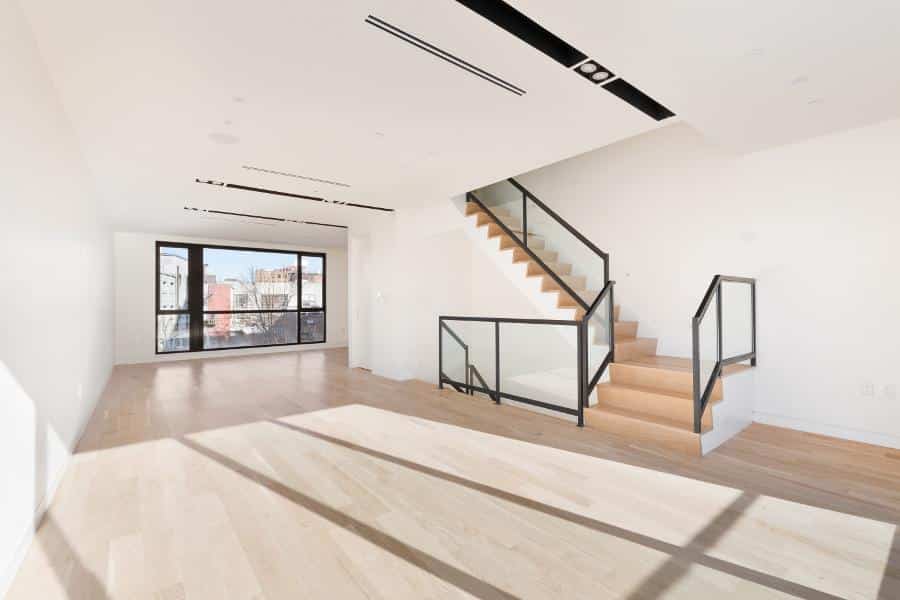
In order to stay flexible and become a hero to buyer’s agents, always have your photographer take pictures of the listing empty before you stage. If you don’t, your virtual stager will charge you an arm and a leg to digitally remove the furniture.
This way, you can virtually stage the same room in multiple different styles or for different uses. You could even try A/B testing the images on Facebook ads to see which one more buyers click on.
Here’s an example of how an empty room can be staged to look radically different from our friends over at Spotless Agency:
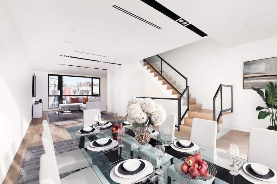
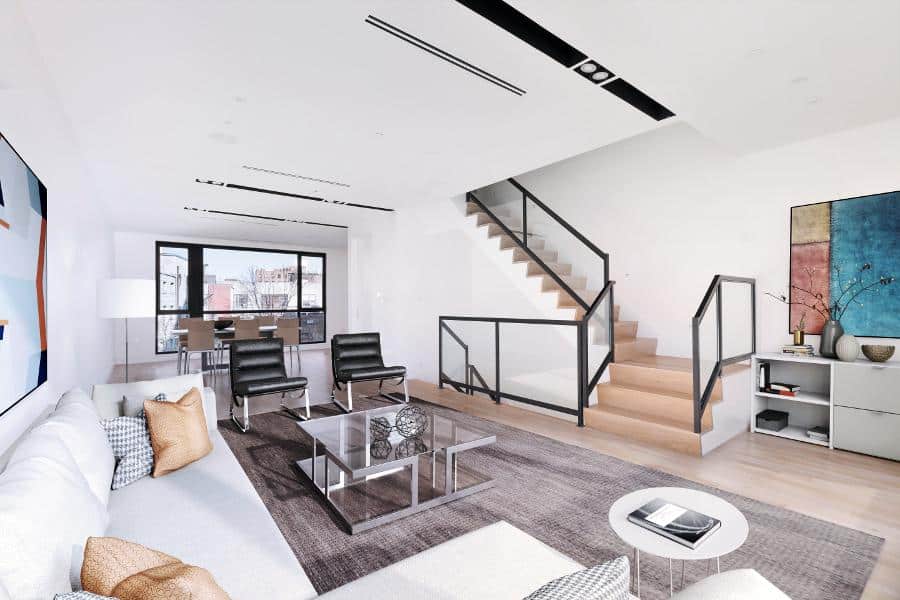
If they had to remove the furniture before staging, virtual staging would be far more expensive.
12. Not Knowing Your Audience

If you want to write a blockbuster movie, a Grammy-winning album, or a killer marketing campaign, there is one rule above all others that determines success: Know Your Audience!
This rule applies to staging your listings as well. As a rule, you should be staging with your audience in mind. Think about what kind of leads might be attracted to the home, the area, or the price point you’re working with.
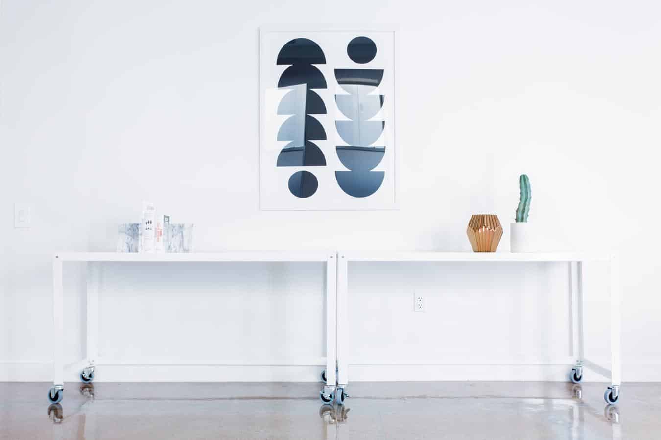
For example, if your listing is in a conservative community with a ton of senior citizens, a more traditional staging will get a much better response than a slick, modern one. Young hip area with lots of college students and young professionals? Minimal graphic art and mid-century furniture is a must.
How the Pros Do It
If you’re not sure about your audience, do some research on your farm area. Who lives there? What do they value?
13. ‘Gendered’ Bedrooms or Playrooms
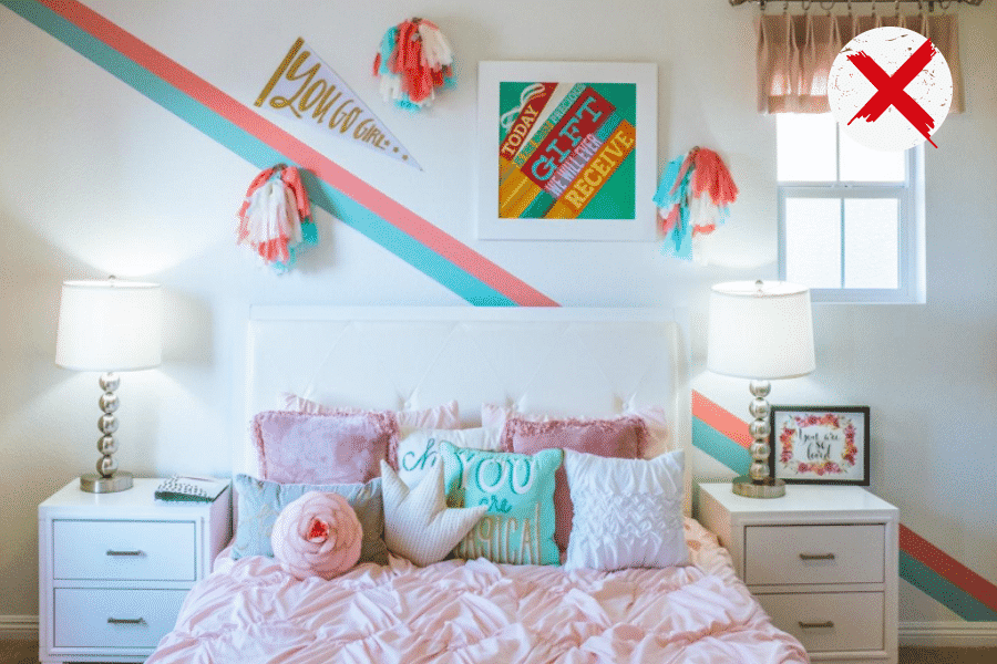
If you decide to stage smaller bedrooms as children’s rooms, you need to be careful about “gendering” the rooms. Remember, the idea here is to create rooms that allow your buyers to dream about living in the home.
A lead with three young boys might have a hard time dreaming about putting them in rooms with pink walls and pom poms.
How the Pros Do It
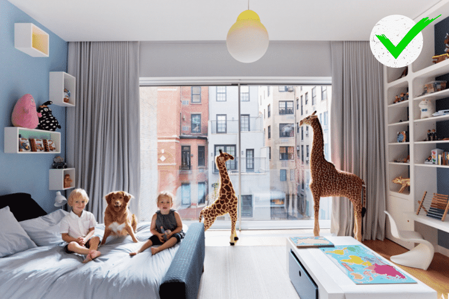
Instead, try to create inclusive children’s bedrooms that reflect the style of the rest of the home. If you’re staging a modern home, a minimal rocking horse, some stuffed animals, and a bunk bed will work.
14. Not Having a Theme for Each Room
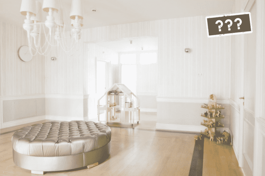
Be careful about staging “multipurpose” rooms. While you do want to be able to show buyers how versatile the space is, sticking to one theme will work much better.
After all, a home office with workout equipment and a hobby space doesn’t help someone who just wants an office imagine themselves in the space. Likewise, if they may want to use that space as a gym or children’s bedroom.
How the Pros Do It
If you truly want to help your buyers imagine themselves in the space, you can stage rooms for one purpose and then have them virtually staged for another. This way you can show a fully realized image of the room serving a single purpose.

15. Using Fake Plants
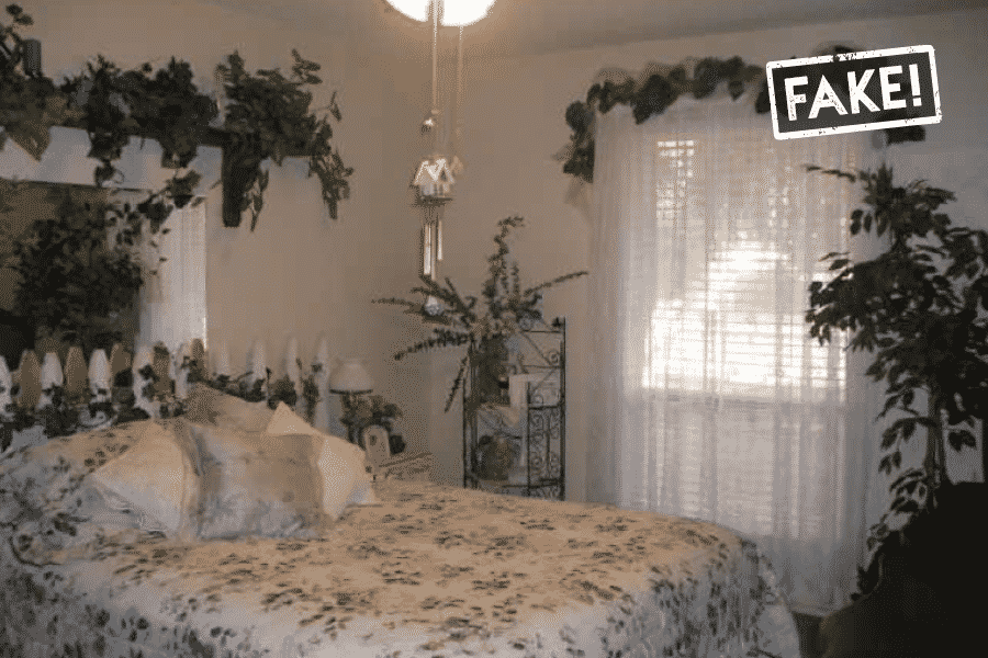
OK, fake plants aren’t the end of the world, but whenever possible, try to use live plants in your home staging.
Believe it or not, you’ll actually save some money in the process. Fake plants that look even halfway realistic are surprisingly expensive.
How the Pros Do It
Buy real plants! By buying or better yet, growing live plants, you get the added benefit of having lush, beautiful plants in your home or office when they’re not being used for staging. A win/win!

16. Cheesy ‘Wall Art’
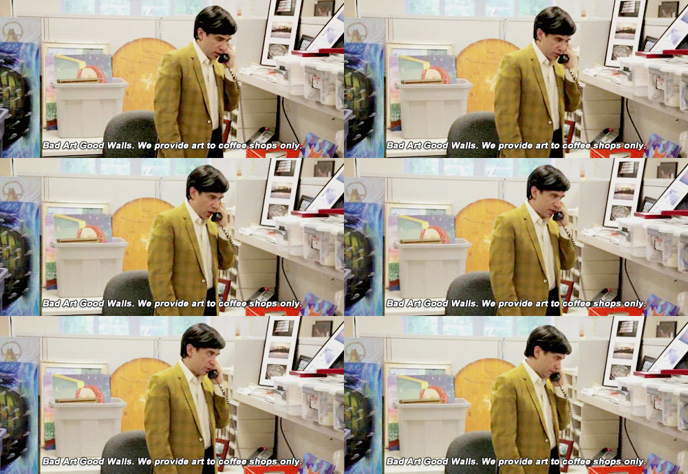
I like to call this one the Holiday Inn deal killer. You know those bland, hideous fake paintings that are nailed to the wall of that cheap hotel room you rented back in college? Everyone else has the same visceral reaction to them that you do. Yuck.
How the Pros Do It
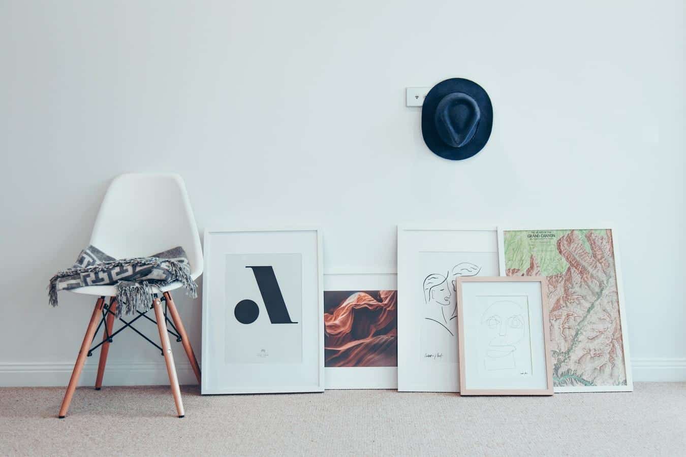
Instead, scour eBay, garage sales, Etsy, or Amazon for a nice set of prints or paintings that can fit multiple styles.
Remember to make sure to match whatever you buy to your other accessories as well. Check out Pinterest or Houzz for inspiration!
17. Not Staging With Table & Floor Lamps

The next time you watch a movie or TV show, notice the lamps. There will generally be a (gorgeous) table lamp in every interior shot. There are two excellent reasons for this: 1. Table lamps give off warm light exactly where you want it, and 2. Both table lamps and floor lamps can make a boring room look dramatic in the evening. Not only that, lamps are usually one of the primary focal points of a room when they’re lit.
So if you want to make your listing look like a home instead of a house, invest in some nice tables and floor lamps in a few different styles. I would go with, say, two matching bedside lamps plus two different table lamps and floor lamps.
How the Pros Do It
You can make a cheap lamp look glamorous by using the right lampshade and right bulb. You can also just swap lampshades to make the same lamp look wildly different if you’re on a budget.

18. Staging Obviously Fake Wine or Dinner Settings

Your whole job as a stager is to draw your guests into the home and imagine themselves actually living there. Even if they know it’s fake, they subconsciously still want to play along because it’s fun.
Setting up fake fruit displays, rubber cakes, and wine and cheese plates that are inedible or (god forbid) fake food will pull them right out of the fantasy and remind them they’re kinda-sorta being tricked into loving the house.
How the Pros Do It
Keep your table and countertops minimal and decorative—unless maybe you want a guest mistaking that wax apple for the snacks you laid out for your guests?

19. Boldly Patterned or Colored Area Rugs

Just because you love that crazy-patterned rug you bought a few years ago certainly doesn’t mean other people will. In fact, the odds are better than even that some of your open house guests will probably HATE the rug. It will also overwhelm a small space the second you unroll it and place it on the floor.
How the Pros Do It
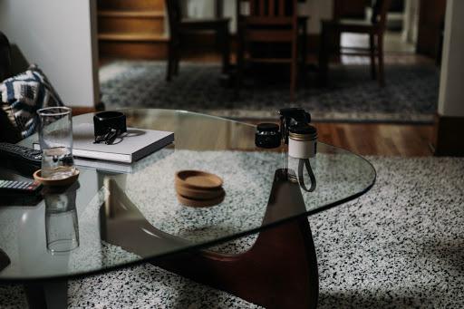
Instead of going for the bold and the beautiful, stick to the subdued and understated. A nice neutral Sisal or even a gray or white shag will do the trick.
20. Pushing ALL the Furniture Right Up Against the Wall

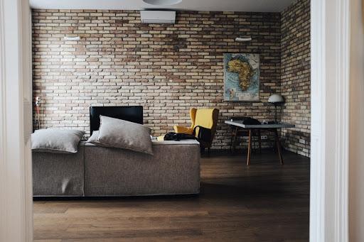
Nothing can make a living room look dull and boxy faster than pushing all the furniture up against the walls. Yes, it’s easy, but it almost always looks terrible. It’s boxy-looking, and it will make a large room look empty and a smaller room look cluttered. It’s the worst of both worlds.
How the Pros Do It
If you’re trying to stage a small room and your only option is to line the furniture up against the walls, then the furniture you’re trying to stuff in that room is just too big to work. Instead, pull out a piece or pull it all out and replace with furniture that actually fits.
21. Not Shopping Online for Original Art or Knock-off Designer Furniture

Have you ever wondered how home stagers can afford such expensive art and furniture? The quick answer is that virtually all of them DON’T. Instead, they get super-expensive-looking goodies for a song for one very simple reason. They know where to look.
While figuring out the secret shopping spots in a big city can take decades, you can cheat and spend a few hours scouring the internet for that perfect “replica” painting or “homage” to that $5,000 Eames chair you want to feature in ALL your listings.
How the Pros Do It
You can start on Amazon, Etsy, and eBay, then move on to Saatchi Art (check out the under $500 section), and finally the holy grail of expensive-looking cheap stuff from China, AliExpress and DHgate.
A word of warning though: This is NOT an option for the faint of heart. It can take a long time to figure out which “replicas” look great and which look like they were designed in a dark room by an old man with glaucoma. Caveat emptor, but just know that this is the El Dorado of cheap stuff you’ve been searching for.
Share Your Best Home Staging Tips
Know some common home staging mistakes that you see real estate agents making? Have some insider home staging tips? Let us know in the comments.


