


With more than 8,000 offices, and 118,000 agents in eighty countries(!), Century 21 is one of the most dominant names in real estate.
Throughout the company’s history, their branding has been iconic enough to become almost synonymous with real estate. In fact, one recent study found that Century 21’s logo was the most recognizable in the industry.
Defying Mediocrity 21st Century Style
Armed with a fresh batch of research from Wakefield, Century 21 pushed ahead with the delicate task of rebranding a household name.
Their goal was to “defy mediocrity and deliver extraordinary experiences”, no easy feat for any brand, but doubly hard for an iconic brand synonymous with traditional real estate branding.
Here’s what they came up with:Quite a difference!
They somehow managed to keep some of the core branding elements of the old logo like the gold/black color theme, and brought them kicking and screaming into the fidget spinner era.
Although I’m a sucker for bold, all caps logos (have you seen our logo?), I think this not only fits my personal aesthetic, but works fantastically well for their brand.
It manages to evoke luxury and glamour, but still remains approachable. While I love the branding for luxury brokerages like Compass, Stribling, or Corcoran, they would all seem laughably out of place on a $90,000 starter home in Ohio.
Hitting the sweet spot between luxurious and approachable also happens to be extremely popular these days. Think Chip and Joanna Gaines country chic interiors or the sudden (and ubiquitous) resurgence of “old timey” logos, farm to table restaurants, and anything and everything ”authentic”.
A Monogram That Can Stand Alone
While I love the new logo, I think many people might be a little turned off by the spartan design. That’s not a problem because pleasing design nerds is not Century 21’s goal here.
Thankfully, they also designed a monogram that can stand on its own. If you want to get an idea of how important that is, think of how iconic the bitten apple brand mark is for Apple. It’s such a good stand in for the brand that many times Apple doesn’t even bother adding their logo.

Anyway, here it is:There’s a lot to like here. The colors translate very well to the monogram, and the shape reminds me of numbers on a vintage race car.
The font is elegant and cool looking, but again, approachable. This would look just as appropriate outside a $10 million Malibu beach house as it would outside a starter home in flyover country.
As I said before, hats off to the designer here. Combining elegance and approachability is no easy feat.
For example, here’s Elliman’s (lovely) monogram.Just as elegant looking, but I can’t help but feel that using this to market a starter home would be like slapping a Rolls Royce logo on a Hyundai.
It’s beautiful, but only works in limited environments. It even uses the same French Racing Blue that Buggati still uses in their branding and livery.
More Than a Fancy New Logo
Like any marketing department worth their salt, Century 21 developed an entire brand concept rather than just a quick update to their logo.
Built around the idea of defying mediocrity, they even built launched a new brand website to help introduce their new brand to the public and the media.
Here’s our friend and all around real estate design and branding geek Deidre Woollard on Century 21’s new brand identity and website:
“Century 21 was very smart in creating their microsite dedicated to explaining the rebrand (rebrand.c21.com). The site showed the bold new direction of the design and also didn’t hide their past under the rug but instead framed it as an evolution. The new look is very modern and clean and on the rebrand site they showcased how the branding lives, not just on signs but on tote bags and marketing materials. The brand is in line with millennial tastes and preferences for san serif fonts, unfussy designs, and bold, declarative statements that can be easily recognized and understood.”
Deidre Woollard

The New Gold Standard for the Bitcoin Era?
As far as slogans go, Century 21 pulled out the big guns years ago. “The Gold Standard” is a clever nod to their past, while still highlighting their current market dominance.
What about their branding? Does it hold up to recent high profile real estate brand creations like Compass, and the Remax rebrand?
I think it does. The graphic design community largely seems to agree, but I suppose we’ll have to wait and see how the market takes to such a bold new identity.
Here’s Armin Vit from branding critique site Under Consideration on the new logo and monogram:
“It may not seem like the most original thing in the world but competing against RE/MAX, Keller Williams, or The Corcoran Group — other major real estate companies — this stands out sharply and boldly. The execution is spot on too, with the angles of the “C” aligning neatly with the “1” and matching those of the “2”. The color combination of gold and dark gray is much more pleasant than the old yellow and black and gives both the wordmark and monogram a more high-end feel.”
Armin Vit

Brand-spotting in the Wild. How Does C21’s Rebrand Work offline?
While most professionally designed brand identities translate well to the real world, some fall flat. Busy, fussy designs that look good on a website can sometimes look terrible on a sign, a toe bag, a T shirt, or any of the thousands of places franchisees will want to put them.
So how does Century 21’s brand work offline ? Have a look:
New Century 21 Signage
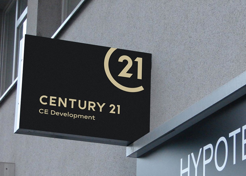
This is just about perfect. Minimal, cool, but still professional and (with time) instantly recognizable.
New Century 21 Flyers
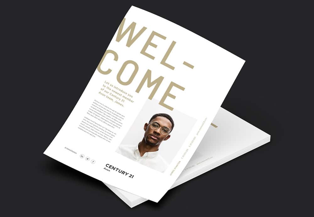
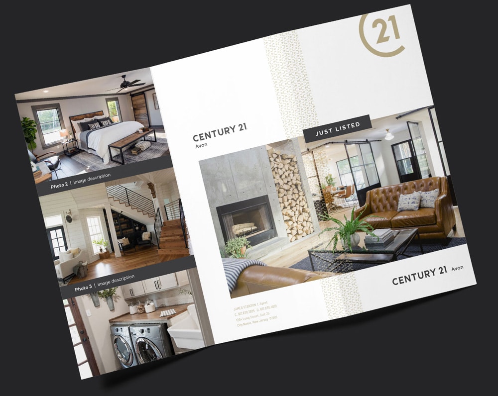
The bold and gold look translates very well to flyers and just listed brochures. Well designed direct mail is a rarity in the real estate industry. These will definitely put C21 agents a step ahead of the competition using Powerpoint or ugly printers templates to create their direct mail pieces.
New Century 21 Tote Bags
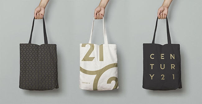
With some fashion forward layout work, the new brand looks fantastic on thee totes.
New Century 21 Business Cards
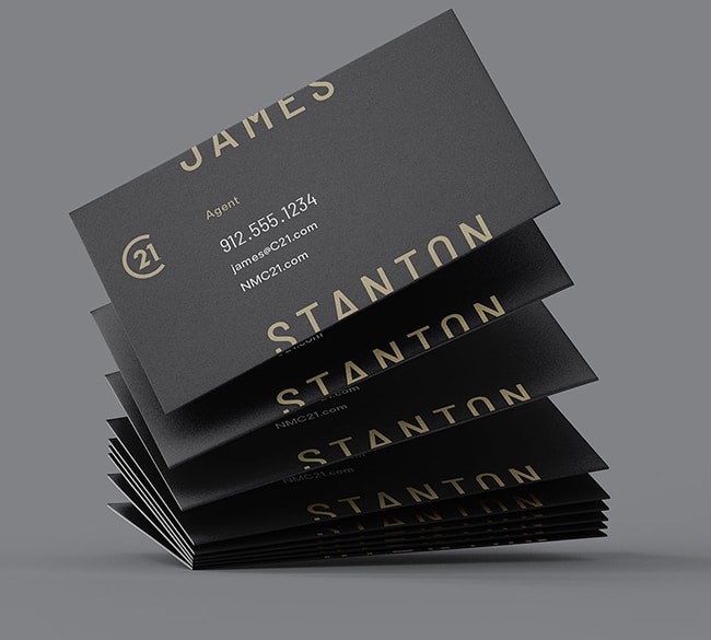
Here’s where I think the “cool” side of the new brand may have been taken a little bit overboard. Not too far overboard mind you, but still not ideal.
While these look great, to me they say “hip graphic designer” rather than “real estate professional”. Too edgy.
Worse, for personal materials like cards, the agent IS the brand. Playing around with names like this is a bit too much of a risk IMHO. Oh, and what about people like me with long crazy names that somehow managed to make it through Ellis Island unscathed?
New Century 21 Yard Signs
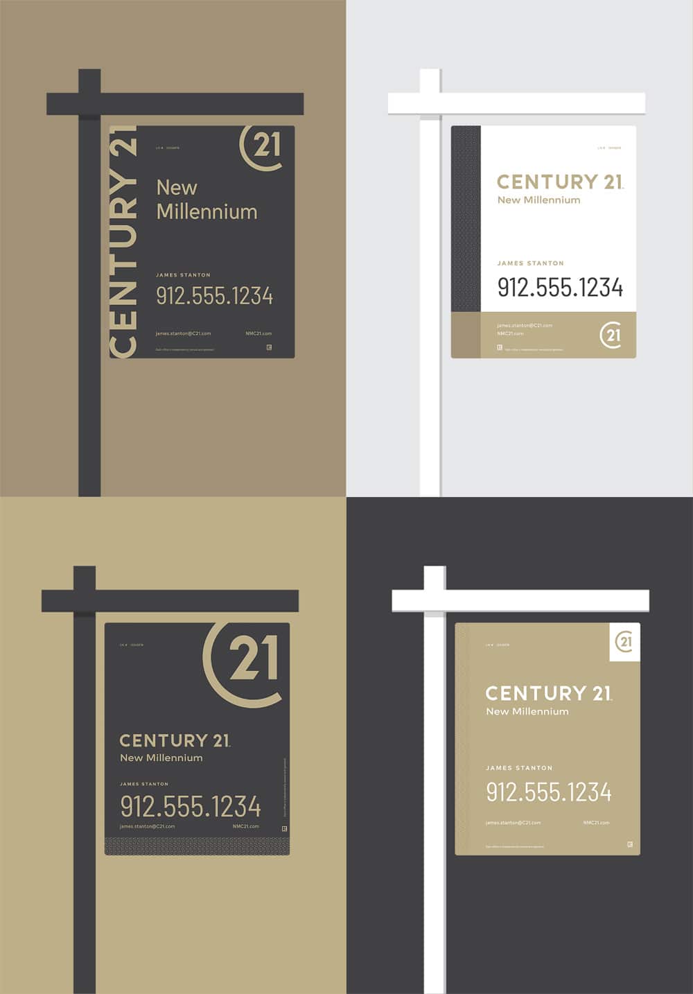
Again, while I think these look great, they seem a bit too muted to work really well as yard signs. That said, I am sure the bold design and agent’s own variations with sign riders etc, will make up for the muted palette.
Micro Identity: Social Media Icons

That monogram seems tailor made for favicons, icons, and avatars for social media. Next to our humble red “c” icon, it makes us want to head back to the drawing board to keep up.
Twitter icon looks just as nice.
Over to You
C21 agent? Graphic design junky? Branding guru? We want to hear your thoughts on the new C21 logo. Hate it? Love it? Let us know in the comments.

Tell us about you so we know what to send.