A few years ago, it seemed like every listing agent was making single property websites for their listings. While they’re less prevalent these days, you have a dizzying array of tools available to build one. To make your life a little easier, we created this guide to single property websites for 2022. We’ll share apps that let you build them quickly and easily, tips for website design, and finally, our two cents on whether they’re still worth your hard-earned time and money.
What Are Single Property Websites?
Single property websites are exactly what they sound like: websites dedicated to one listing and one listing only. Single property websites generally include beautiful photography of a listing, video walk-throughs, Matterport Tours, or anything else that won’t fit on your MLS or on Zillow. They can be a great way to impress homeowners or highlight a unique luxury or historic listing. Here are the top single property website builders we think are actually worth your time and money.
5 Best Apps for Building Single Property Websites
| Website Builder | Pricing | Best For |
|---|---|---|
| Rela | $24 per month (1 site) | (Best overall) Luxury listings |
| Listings Unlimited | $24.95 per month (1-25 sites) | Brokerages that need single property sites in bulk |
| Cribflyer | $7 per month (as low as $1.25 per month in bulk) | Affordability (for single sites) |
| WordPress themes on ThemeForest (DIY) | ~$10-$60 per template (1-time fee) | Endless customization |
| Unbounce (DIY) | $81 per month (paid yearly) | Lead capture and general landing pages |
Rela

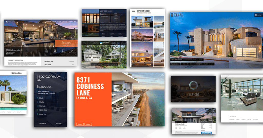
About Rela: Rela offers gorgeous single property website templates that will work perfectly for luxury listings and impressing homeowners.
Pricing: $24 to $99 per month
Best features: Rela offers listing agents and brokerages great features like an easy-to-use site builder, CRM, integrated Facebooks ads, lead forms, 3D tours, lead routing, videos, and basic analytics. You can also connect Zoom, Facebook Live, and Google Hangouts to the site for virtual open houses.
Drawbacks: While we loved the beautiful layouts available on Rela sites, they cost quite a bit more than Listing Unlimited or Cribflyer. If you really want to impress your homeowner or need a pearl in the marketing section of your listing presentation, Rela is a solid choice. Rela also has a lot of bells and whistles, we’re just not sure most agents will actually use them.
Example Rela website: Dax Template
5 Easy Steps to Master Your Real Estate Listing Presentation
Listings Unlimited

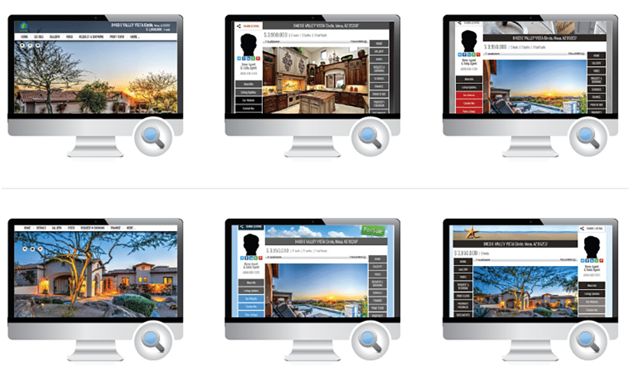
About Listings Unlimited: Although their templates aren’t quite as nice as Rela’s, Listings Unlimited has a lot to offer agents and brokers.
Costs: $24.95 per month for one to 25 listings and 89 cents per listing after that
Best features: You get 25 sites, a video builder, 3D tours, syndication to YouTube, a QR code generator, feedback tool, social media tool, flyer builder, and a CRM.
Drawbacks: While Listing Unlimited’s templates are fine, let’s just say they won’t win any design awards. The pricing is also prohibitive for single agents who just want one or two websites. You pay $24.95 per month even if you only need one website.
Example Listings Unlimited website: Listings Unlimited Template
Cribflyer

About Cribflyer: Although they only have three templates to choose from, they look nice, and Cribflyer has some decent features for agents and brokerages. It’s also the most affordable for people who only need one site at a time.
Costs: $1.25 per site, per month (in bulk); $7 per site, per month (individual sites)
Best features: Cribflyer gives you 3D tours, printable flyers, SMS text codes, lead routing, pixel tracking, and social media tools.
Drawbacks: Cribflyer’s sites are not quite as nice looking as Rela’s and don’t have the bells and whistles Listing Unlimited’s sites have.
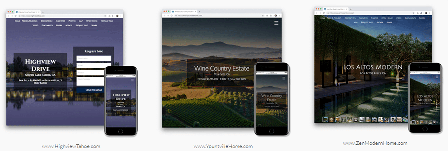
Example Cribflyer website: Zen Modern Home
WordPress Single Property Themes on ThemeForest

About WordPress Themes on ThemeForest: Even though dedicated single property website builders are great, they’re not THAT cheap, and if you’re already skilled in WordPress, you can basically build sites for free. All you need is some basic WordPress skills to customize your current template, or a few dollars to buy single property templates from sites like ThemeForest. The only catch is that you need a WordPress website to use them.
If you want to get started building a WordPress site with IDX, check out our in-depth guide below.
How to Build an IDX Real Estate Website in an Afternoon (2022)
Costs: $10 per year URL hosting, approximately $10 to $50 per template (one-time fee)
Best features: Affordable one-time cost, endless customization options, no monthly fees, many attractive templates, can integrate with your current WordPress site and CRM.
Drawbacks: Steep learning curve
Example WordPress Theme website: Spacey Theme
Unbounce

About Unbounce: Another way to build single property sites is by using a landing page builder like Unbounce. Like the dedicated builders, Unbounce has an easy-to-use editor and you can build sites pretty quickly. Unbounce’s templates are also built for conversion, and even let you A/B test different versions of your site to see which converts better. You can also use Unbounce to build landing pages for Facebook ads, Google ads, or anywhere else you’ll need a landing page.
5 Clever Real Estate Landing Pages That Convert Like Crazy
Costs: Starting at $81 per month
Best features: Lead capture, can build other landing pages, A/B testing.
Drawbacks: Not designed for real estate landing pages; high price if you don’t make other landing pages.
Example Unbounce website: Destination Homes
Visit ThemeForest for More Unbounce Single Property Templates
Single Property Website Tips & Tricks for 2022

1. Include Content That Isn’t Available Anywhere Else
A great way to get people to go to your single property site is to promise content that isn’t available anywhere else. You can offer extra pictures, videos, floor plans, neighborhood information, or anything else that you are comfortable leaving off Zillow. Just remember that the content doesn’t necessarily have to be amazing, but it has to sound good enough to get someone to click.
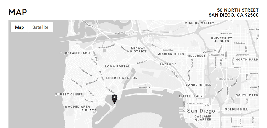
2. Include Maps & Other Useful Data That Keep People From Clicking to Another Site
Data is king in 2022, and if you can generate data that is not available anywhere else, then you might be able to easily drive traffic to your site.
3. Use Large Photos & Videos, but Make Sure They’re Optimized to Load Quickly
People don’t want to squint at tiny pictures, especially on the desktop. Make sure your pictures are at least 900 pixels wide by 600 pixels tall at 72 DPI. At this resolution, your pictures will look crisp but will still load quickly.
4. Make Sure Your Site Is Mobile-friendly
A huge percentage of your audience, especially those clicking over from Facebook, will be visiting your site on their phones or tablets. Make sure your website looks great on the small screen.
5. Get Permission From the Homeowners to Post Their Address & Photos Online
While you may be able to legally get away with posting photos and address information online, it’s polite to inform your seller that you are going to leave the site up. To help sweeten the deal, you could include handy links to gas hookup, cable hookup, and other local information and offer it to the sellers as a resource after they move in.
6. Try to Answer Every Question a Buyer Might Have, Including Maps & MLS Data
This is a tricky one, but the more information you can include on the site about the neighborhood, the better. You likely won’t have room for articles, but you can and should include lots of pictures and at least a quick guide to the neighborhood with a few pictures or maybe just a video.
7. Update the Page Once the Listing Is Sold
Remember that your MLS won’t be pleased if you leave a listing up without mentioning that the deal is closed and it’s no longer available.
7 Web Design Tricks for Realtors to Get More Leads
The Case for Single Property Websites: 4 Ways They Can Still Have an ROI in 2022
Since we try to be optimistic here at The Close, we’ll go ahead and start with the reasons why you might want to consider investing your time, effort, and money into single property websites for your listings this year.
1. Boomer Homeowners Are Still Impressed by Single Property Sites

Let’s be honest: We’re still living in an age where a decent majority of homeowners are still baby boomers. They landed on the moon, ended the Cold War, and even invented the technology that still serves as the backbone of the internet. But when it comes to digital marketing … well, let’s just say they’re not quite up to speed.
Now don’t get me wrong—this can mean an excellent opportunity to explain to your boomer homeowners the inherent value (or lack thereof) in the latest and greatest digital marketing fads.
The only problem is that there are going to be other agents who are using the exact opposite argument to win them over—and they have flashy pictures and can send them their own “www site on America Online.”
So, Why Not Give Them What They Want?
For the price of a cup of good coffee per week, why not give them the shiny bells and whistles their granddaughter who “knows computers” told them they need?
You’re not going to end up hurting anything, really, and it might actually encourage them to send your single property site out to friends and family.
Referrals are referrals, right?
2. There’s No Competition for Clicks on a Single Property Website

Let’s face it—we all want to make good decisions. Whether that means kale over potato chips, taking the stairs instead of the elevator, or keeping the phone off when you go to bed, we all try to do the right thing. If you want to make those decisions easier for your leads, studies show that you need to reduce the friction that comes between them and the right choice. For example, you might keep your kale front and center in the refrigerator, or lock your phone in a box when you go to bed.
When it comes to influencing people to click where you want on your website, the same rules apply. The goal is to make clicking on that “contact us” button as easy as humanly possible for your audience.
In the marketing world, we call this CRO, or conversion rate optimization. It’s basically the art and science that designers and marketers use to make sure you click the link they want you to click.
Reducing friction is one of the most common ways to guide people to click where you want them to. That means the fewer distractions they have on the page, the more likely they are to contact you.
Fewer Distractions = More Clicks
On social media, the distractions are basically endless, which partly explains why click-through rates are so low on Facebook and Twitter. Even on your own website, there will be other listings, your blog, and other shiny objects that can keep people from clicking on the big “make an appointment” button.
On a well-designed single property website, almost all of the friction is removed, and the “contact us” button is pretty much the only option. This can—and often does—mean much higher click-through rates.
3. Single Property Website Builders Offer Professional-looking Websites for a Very Attractive Price
Since websites aren’t cheap and web design is hard, not every agent has a super-professional site. That’s not the end of the world in the age of real estate Instagram and YouTube, but every little bit helps.
Since you can build gorgeous websites for less than $25 per month using single property website builders, it can be a cheap way to build up an online presence that looks like you spent a ton of money on it.
4. Single Property Websites Still Look Great in Your Listing Presentation
Let’s face it: Since getting listing leads is hard, pitching them successfully is a must. That’s why having a killer comparable market analysis (CMA) and listing presentation are not optional if you want listings. The only problem is that newer agents often only have a handful of closed deals to point to and even fewer case studies for marketing homes successfully.
Here’s where your small investment in single property websites can come in handy. Instead of just the usual menu of listing photographs and Facebook ads, you can show off the professional-looking websites that you make for every listing you get. The nice thing is that they often end up looking like they took you a long time to make. In reality, of course, you can knock one out in a few minutes once you get comfortable with a single property website builder.
Why Single Property Websites Might Be a Waste of Time in 2022
Even though we try to be optimistic, we want to give you the whole story, not just the story that makes real estate software companies happy. That’s why instead of pushing you into buying yet another app you don’t really need, we’re giving you three good reasons why single property websites might not be worth your time in 2022.
1. Single Property Websites Only Really Make Sense for Historic or Expensive Listings
To be frank, one of the main selling points for single property websites is the URL itself. It’s like an actor who can brag about having an IMDB page. The mere fact that someone took the time to create a URL and make a website for a house confers a certain sense of importance.
That’s why you’ll find many high-end homes or historic homes have their own sites. However, if you take away the glamour shots of that incredible house—well, there’s not really much left, is there?
Now imagine that same site with 10 pictures shot by your bored MLS photographer of a $125,000 ranch in Ohio—in the middle of winter. Kind of kills the whole exclusivity thing, right? It’s almost like putting a velvet rope and bouncer outside of your local bowling alley. No one’s buying the idea that the bowling alley is suddenly an exclusive club.
2. You’re Not Offering Anything of Real Value for Buyers
Another reason why single property sites might not work for you is that pretty much everyone who visits the site comes from a source that might have MORE information than your site does.
For example, I’ve seen people link to single property sites from Zillow or their own website. The whole point of having listings on sites like Zillow is that you can offer visitors a ton of information about the listing, about you, about buying in general, and so on. So chances are they’re clicking over to a new website that has LESS information than the one they’re on!
Of course, you can always get clever and save some nice pictures, a walk-through video, or other goodies for your single property site. You can then entice people to click by saying something like “check out 123mainstreet.com for more exclusive pictures and a virtual tour.” The only issue is that you then have to actually do it. Keeping pictures or videos that help you sell on a private site that only a certain percentage of people are going to click on probably isn’t a great strategy for marketing your listing.
3. The Same Traffic Might Convert Better on Your Website
Another hard truth about marketing a listing is that only a small percentage of the people who click on a listing or even come to an open house will be interested in making an offer. This is something that every listing agent discovers early and often in their career. Buyers just want to look at listings. Even non-buyers want to look at listings!
Considering the low odds of converting a site visitor on a single property site, wouldn’t it make more sense to try to entice those people into contacting you for another reason? Most often, that reason will be another listing, but someone might also be looking for honest advice or just some information on the local market. Since you have basically unlimited pages on your website, you can curate listings, write content, or shoot videos that might encourage one of those visitors to see the place and maybe even become a client.
Over to You
What do you think about single property websites? Do you use them to market listings? Do you think they still make sense in 2022? Let us know in the comments or join our private Facebook mastermind group to discuss with other agents.


Add comment